HOW TO CREATE DASHBOARD USING POWER BI
Many Dataset available in Kaggle choose any one if you don't have here i have choosen HR dataset and loaded it as shown below

Now as i have list of all Hiring Years I will use Slicer option as shown :


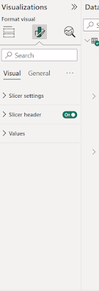
To make it look good we will go in slider settings and change it accordingly here i am doing it as a tile .
then it will look like this

Now in visualization add some background color

now add color in tiles so for that click on tile and then in visualization in general go to effects and add color accordingly
this is how it will look like after adding color and some shadow accordingly

now add different different plots and graphs according to data :

THANK YOU!!!!

Comments
Post a Comment